BOTTOMS UPA little playful.
A little unexpected.
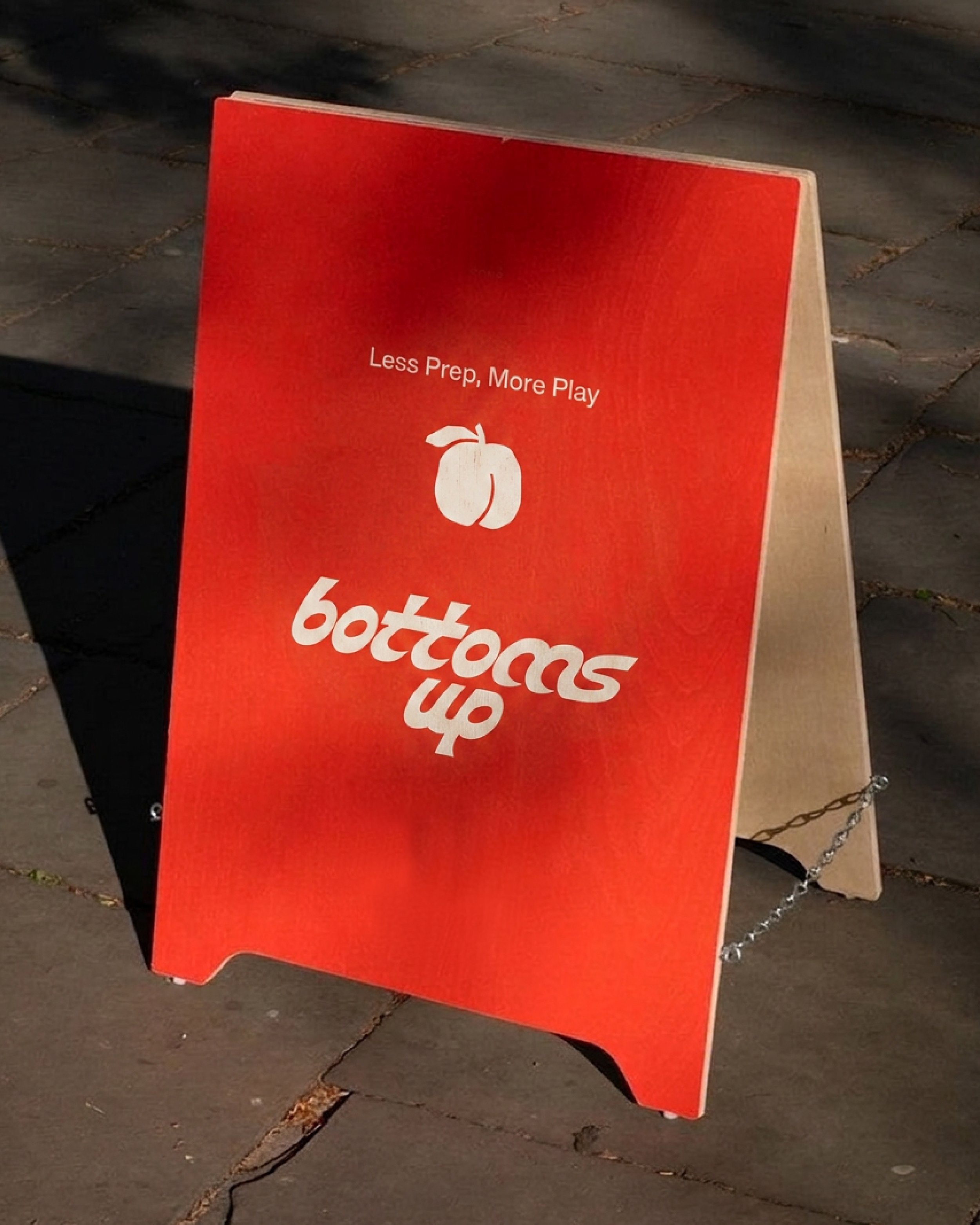
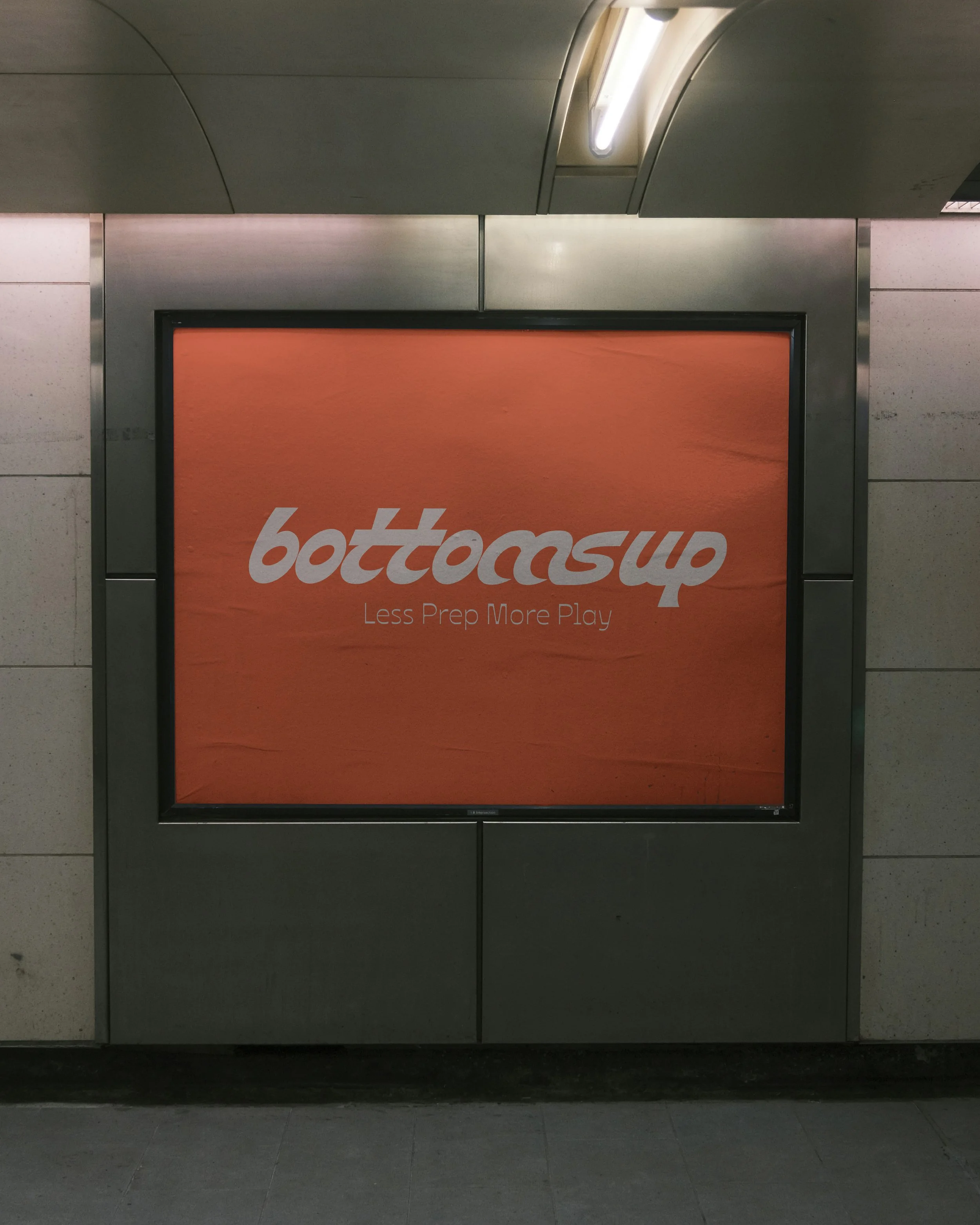
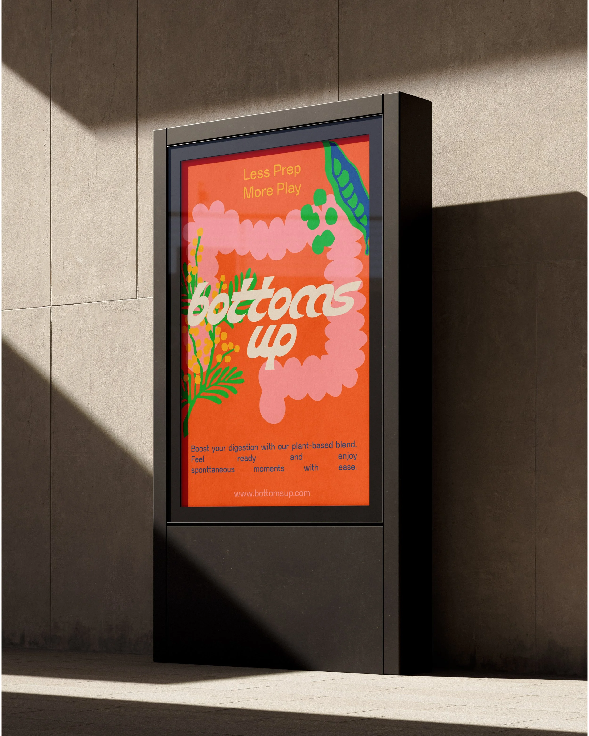
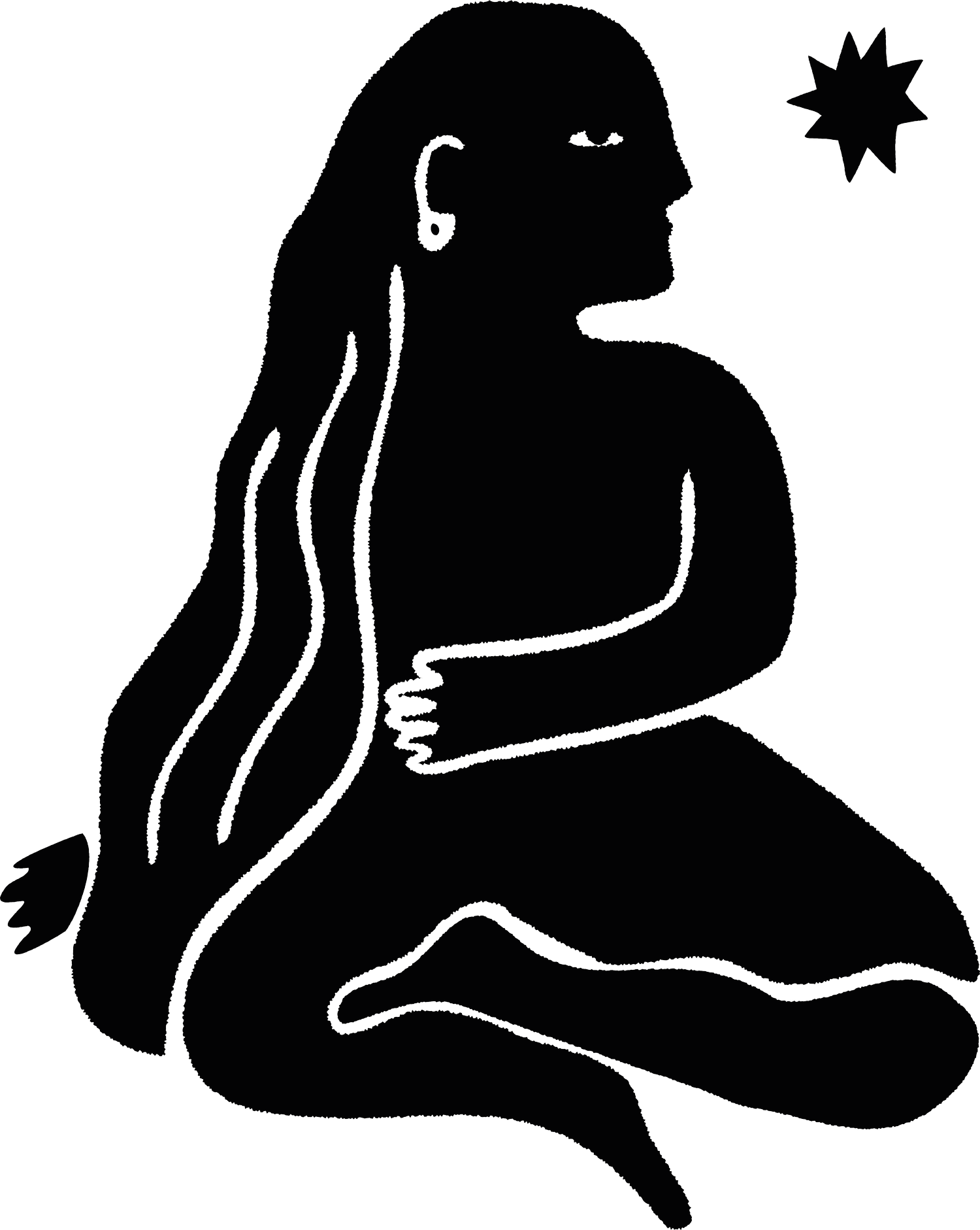
For Bottoms Up, I leaned into bold typography, warm colours and playful details to create
a brand with character. One that's memorable from the first look and still feels approachable.
The custom wordmark became the foundation of the identity, supported by a visual language that feels expressive without being overwhelming. Every element was designed to bring
a sense of energy and personality, creating a brand that's easy to recognise and even easier
to connect with.
SERVICES
Brand Strategy, Creative direction, Visual Identity
INDUSTRY
Consumer Goods
KEYWORDS
Bold • Playful • Inclusive • Expressive
LOCATION
Germany